# Initialize Otter
import otter
grader = otter.Notebook("geography-population.ipynb")
# This coding cell imports some python libraries that we will be using throughout this notebook
# Don't worry about what they are, just run this cell before running any other cells below this one
from datascience import *
import numpy as np
#import otter
grader = otter.Notebook("geography-population.ipynb")
%matplotlib inline
import matplotlib.pyplot as plt
plt.style.use('fivethirtyeight')
from IPython.display import YouTubeVideo
from ipywidgets import interact, interactive, fixed, interact_manualPopulation
Population growth is more complicated than simple numbers. While tt may be easy to look at a country with a high birth rate and think “large population”, this usually the case.
For example, the two most populated countries in the world, China and India, have a birth rate of 1.1 and 2.03 respectively. We also tend to look at high birth rates and large populations and think: numbers tell all. In reality, the consumption rate of Americans is 36 times more than Indians. So, numbers don’t tell us the entire story.
Let’s investigate and compare the population growth and its causes in different countries. We’ll look at:
total world population over time
we will select a couple of countries of interest and look at their total population over time
Does this tell us anything about birth rates and death rates? The age of the population?
a better statistical view is a population pyramid: population by age
1. World Population Over Time
Yes, the world population is increasing, but how much? Let’s look at the data (from https://
Just run the code cell below to:
STEP 1: Upload the dataset in our notebook as a table.
STEP 2: Create a plot to visualize the table data.
# Let's first look at the total world population by gender
world_POP = Table.read_table('https://cal-icor.github.io/textbook.data/sbcc/geog-102/FAOSTAT_data_worldTotalPOP.csv')
world_POP.show(3)
def plot_countryPOP_overTime(POP_table, countryName):
    POP = POP_table.where('Area',countryName)
    POP = POP.with_column('Value', POP.column('Value')*1000) # Adjust units
    POP_all= POP.where('Element', "Total Population - Both sexes").select('Year', 'Value').relabeled('Value','Total')
    POP_all_F = POP.where('Element', "Total Population - Female").select('Year', 'Value').relabeled('Value','Female')
    POP_all_M = POP.where('Element', "Total Population - Male").select('Year', 'Value').relabeled('Value','Male')
    combined = POP_all.join('Year', POP_all_F, 'Year').join('Year', POP_all_M, 'Year')
    combined.plot('Year')
    plt.title('Population\n'+countryName)
    return countryName
plot_countryPOP_overTime(world_POP,'World')
Question 1: What is the estimated world population today? In the next coding cell, set the variable worldPOP equal to the number 1, 2, 3 or 4 accordingly:
The estimated world population is close to 4 million
The estimated world population is close to 4 billion
The estimated world population is close to 8 million
The estimated world population is close to 8 billion
# Replace the ... with 1, 2, 3 or 4
world_POP = ...grader.check("q1")2. Comparing population growth in different countries
Let’s have a look at the differences in population growth trends. Just run the cell below to visualize the data for the USA. Is the growth trend similar?
world_POP_countries = Table.read_table('https://cal-icor.github.io/textbook.data/sbcc/geog-102/FAOSTAT_data_POP_Complete.csv')
# Let's focus in on the population in the United States of America.
plot_countryPOP_overTime(world_POP_countries, 'United States of America')
Question 2.1: Does the population growth in the USA follow the same trend as the world? Describe your observations of the graphs above.
Type your answer here, replacing this text.
Now, let’s look at a different country!
Question 2.2: In the coding cell below, change the variable new_country_Name to equal a different country (put the name in quotes as it should be a string type). Pick a country from this list:
China
India
Saudi Arabia
Nigeria
# change the ... to a country name. Make sure to write the name in quotes, just like the example above
new_country_Name = ...
country = plot_countryPOP_overTime(world_POP_countries, new_country_Name)grader.check("q2_2")Question 2.3: How does the population change over time in this country compared to the population in the USA? Is there a difference between the male and female population growth? Why do you think this is? Refer to what was discussed in lecture.
Type your answer here, replacing this text.
3. The Population Pyramid: a better way to investigate
Although the above plots give us an idea of which country’s population is still growing the most, it does not tell us information on why we see differences between the different countries. Is it the birth rate, the death rate? Something else? This is where a population pyramid can tell us more. Run the coding cell below to learn more about population pyramids.
# The original URL is:
# https://youtu.be/RLmKfXwWQtE

YouTubeVideo("RLmKfXwWQtE")
Data below from census data recorded on the International Database (IDB): https://
The IDB includes population estimates and projections for 227 countries and equivalent areas, plus 15,237 subnational areas. Just run the cell below to:
STEP 1: Upload the dataset in our notebook as a table.
STEP 2: Create a population pyramid to visualize the data of the USA.
# This table includes population estimates for 2024 and was downloaded on 4/3/2024
Int_Census_POP_2024 = Table.read_table('https://cal-icor.github.io/textbook.data/sbcc/geog-102/IDB_04-03-2024.csv')
Int_Census_POP_2024.show(2)
# Generic function to display statistics and population pyramid for 1 country

def populationPyramid(countryName):
    '''countryName is the name of a country of interest, data type is string
        POP_data is the .csv file containing the data, data type is a string, note that the .csv file needs to be in the right format
        year is the year of interest, make sure it matches the year in the table
    '''
    Int_Census_POP = Int_Census_POP_2024
    year = 2024
    POP_by_age = Int_Census_POP.where('Country/Area Name', countryName)
    print(countryName+ ' Statistics:')
    print('Total Population in million = ' + str(POP_by_age.row(0).item(4)/1000000))
    print('Total Male Population in million = ' + str(POP_by_age.row(0).item(6)/1000000))
    print('Female Population in million = ' + str(POP_by_age.row(0).item(8)/1000000))
    POP_by_age = POP_by_age.take(range(1, POP_by_age.num_rows)) # Take of total

    # Create figure and axes
    fig, ax = plt.subplots()
    age_groups = POP_by_age.column('GROUP')

    # Plot male population
    ax.barh(age_groups, POP_by_age.column('Male Population'), color='blue', label='Male')

    # Plot female population with negative values to make it left-aligned
    ax.barh(age_groups, [-x for x in POP_by_age.column('Female Population')], color='purple', label='Female')

    # Set labels and title
    ax.set_xlabel('Population')
    ax.set_ylabel('Age Group')
    ax.set_title('Population Pyramid '+ countryName + ' ' + str(year))
    ax.legend()

    # Show plot
    plt.show()

# Let's look at the US
populationPyramid('United States')
Time to compare population pyramids around the world!
Run the code cell below, this will create an interactive population pyramid!
Now you can pick a country name by selecting from the dropdown menu.
In section 1, you investigated the difference between the USA and 1 other country. Now it is time to compare the population pyramids for both. (Note: make sure you pick the sam country as you picked in Question ...). Observe and answer Question 3.1.
# interact also allows you to pass in an array for a function argument. It will
# then present a dropdown menu of options.
uniqueCountryList = list(set(Int_Census_POP_2024.column('Country/Area Name')))
uniqueCountryList.sort()
_ = interact(populationPyramid, countryName = uniqueCountryList)
Question 3.1: Describe your observation for both countries. Are the population pyramids similar/different? How?
Type your answer here, replacing this text.
Question 3.2: Let’s look at a couple of other countries using the interactive/dropdown coding cell above! Pick 2 countries in the Global North and 2 in the Global South. Describe the similarities and differences in population pyramids.
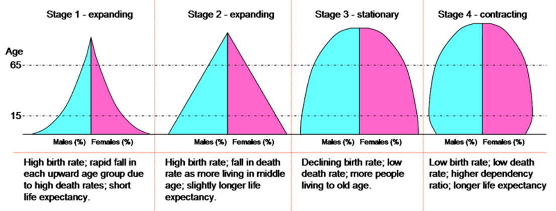
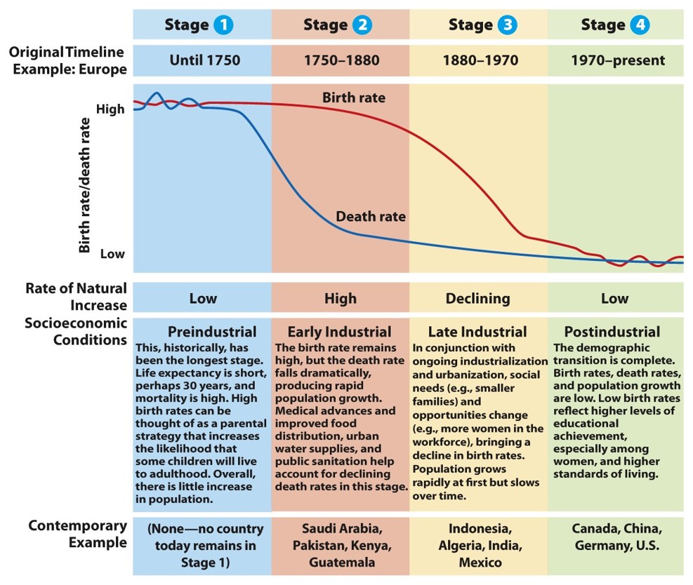
Use the images below as a reference to describe the transition stage for each country.
Type your answer here, replacing this text.
CONGRATULATIONS! You just finished the jupyter notebook assignment for module 4! Be sure to...
run all of the tests and verify that they all pass,
choose Download as PDF from the File menu
submit the .pdf file on canvas.
Notebook developed by:
Nathalie Guebels, Assistant Professor, Computer Science, Santa Barbara City College
Geordie Armstrong, Assistant Professor, Geography, Santa Barbara City College