# Initialize Otter
import otter
grader = otter.Notebook("geography-development.ipynb")
Development Geographies!
The goal of this activity is to review some of the material presented as part of module 2 by considering data from the Food and Agriculture Organization (FAO) of the United Nations. We will look at data from different continents in order to ...
Answer questions about the cost and affordability of a healthy diet
Observe differences between the number of people who can afford a healthy diet
Compare the cost of a healthy diet in different locations
Focus in on the cost of starch staples, animal products, vegetables, fruits, etc.
To get started, just run the code cell below to import some python libraries that will be used throughout this notebook.
# This coding cell imports some python libraries that we will be using throughout this notebook
# Don't worry about what they are, just run this cell before running any other cells below this one
from datascience import *
import numpy as np
import otter
grader = otter.Notebook("geography-development.ipynb")

%matplotlib inline
import matplotlib.pyplot as plt
plt.style.use('fivethirtyeight')

from IPython.display import YouTubeVideo
Before we look at data, it is important that we understand some key concept such as the Human Development Index (HDI).
Click on the following link to review What the HDI measures? and answer Question 1.1 below.
Question 1.1: Of the following, which one is NOT measured by the HDI?
Education level
Life expectancy
Income
Food security
Answer in the code cell below, by setting the name (variable) not_HDI equal to 1, 2, 3 or 4. Then run the code cell.
# Replace the ... with the correct number 1, 2, 3 or 4.
not_HDI = ...grader.check("q1_1")1 Feeding the World...
Although food insecurity is not measured using the Human Development Index (HDI), it is important to understand when we look at development geographies.
Food insecurity is when someone isn’t sure if they will eat regularly, and/or do not have access to a varied diet with sufficient nutrition. This can impact an individual, household, neighborhood, or entire region. Food insecurity has a significant impact on a person’s health and life. It’s an important factor to consider when assessing equity. Food insecurity impacts education, physical development, productivity, and reduces overall earnings. As such, it impacts the broader economy.
Before we look at data and visualize, let’s run the code cell below to watch a video on feeding the world.
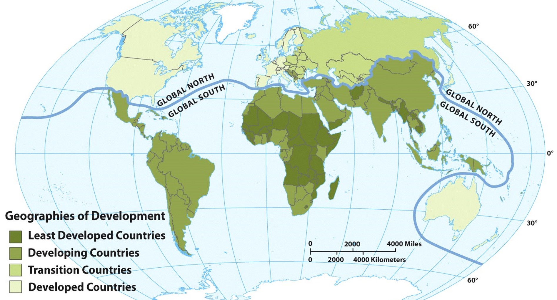
Ask yourself: How is food insecurity different in the global south versus the global north?
# How to feed the world video:
# The original URL is:
# https://youtu.be/QloMOOG-bbE

YouTubeVideo("QloMOOG-bbE")
Question 1.2: In the video, Guzman abandons his manioc farm to work in the city. This reduction of small farmers contributes to food insecurity by creating a dependency on _________:
urban gardens
food imports
aquaponics
a plant based diet
Answer in the code cell below, by setting the name (variable) dependency equal to 1, 2, 3 or 4.
# Replace the ... with the correct number 1, 2, 3, or 4
dependency = ...
grader.check("q1_2")1.1 A closer look at the cost and affordability of a healthy diet
Now let’s look at the cost and affordability of a healthy diet in different continents. The dataset we will explore in this section comes the Food and Agriculture Organization (FAO) of the United Nations. We will follow the same steps as in the notebook for module 1:
STEP 1: Gather and upload the dataset in our notebook as a table. Just run the cell below to see the tabular data we will start with.
Note: Don’t feel overwhelmed. Yes, this is a big table with lots of data. It is often hard to make sense of a large dataset. The next coding cells will help us focus in on specific data of interest in the next cells.
CAHD_data_regions = Table.read_table('https://cal-icor.github.io/textbook.data/sbcc/geog-102/FAOSTAT_HealthyDiet_regions.csv')
CAHD_data_regions.show()
Let’s focus in on 2 variables related to food insecurity:
The % of the population unable to afford a healthy diet
The cost of a healthy diet (PPP $ per person per day)
Run the next code cell below to look, to reduce the tabular data and focus on these variables. The table will be more legible and should help you answer the next question.
#This data set has a lot of information, let's focus in on some data of interest
pop_percent_unable = CAHD_data_regions.where('Item','Percentage of the population unable to afford a healthy diet (percent)').select(
    'Area','Year','Value').relabeled('Value','% unable to afford')
cost_healthy = CAHD_data_regions.where('Item','Cost of a healthy diet (PPP dollar per person per day)').select(
    'Area','Year','Value').relabeled('Value','Cost (PPP $ per person per day)')
pop_data = pop_percent_unable.with_column('Cost (PPP $ per person per day)', cost_healthy.column(2))
pop_data.show()
Question 1.3: Which region has the lowest food insecurity?
Africa
North America
Western Europe
Answer in the code cell below, by setting the name (variable) low_Insecurity equal to 1, 2, 3 or 4. Then run the cell.
# Replace the ... with the correct number 1, 2, or 3
low_Insecurity = ...
grader.check("q1_3")Question 1.4: Where is the cost of a healthy diet the highest when looking at these 3 regions?
Africa
North America
Western Europe
Answer in the code cell below, by setting the name (variable) high_cost equal to 1, 2, or 3. Then run the cell.
Ans: 1
# Replace the ... with the correct number 1, 2, or 3
high_cost = ...
grader.check("q1_4")Now that we have the data in a tabular format, let’s go to
STEP 2: Visualize the table data by using a bar chart or a plot. This often helps determining, finding, and comparing trends.
Just run the cell below. It contains plotting helper code (a helper function) that we will use to answer Question 1.5 (below).
def plotCountryData(tableName, countryName):
    country_data = tableName.where('Area', countryName).drop('Area')
    # Create a figure and a set of subplots
    fig, (ax1, ax2) = plt.subplots(1, 2, figsize=(12, 6))

    # Plot % od population unable to afford on the first subplot
    ax1.plot(country_data.column(0), country_data.column(1), 'r-')
    ax1.set_title('% of Population\nunable to afford healthy diet\n'+countryName)
    ax1.set_xlabel('Year')
    ax1.set_ylabel('Unable to afford (in %)')

    # Plot cost of diet on the second subplot
    ax2.plot(country_data.column(0), country_data.column(2), 'b-')
    ax2.set_title('Cost of a healhty diet\n per person per day\n'+countryName)
    ax2.set_xlabel('Year')
    ax2.set_ylabel('PPP (in $)')

    # Adjust layout
    plt.tight_layout()
    return countryName
Question 1.5: In the next cell we will call the plotting function to look at the trends in the 3 different regions. To get you started, just run the code cell below, it will plot the data for Africa.
Now let’s add 2 more lines of code for Western Europe and Northern America:
In the code cell below, replace the ... and set plot_W_Europe and plot_N_America equal to calls to the function plotCoutryData() using the correct region name. Use the existing line of code as an example, you can copy plotCountryData(pop_data,‘Africa’) and
Replace ‘Africa’ with ‘Western Europe’ on line 2 for plot_W_Europe
Replace ‘Africa’ with ‘Northern America’ on line 3 for plot_N_America
plot_Africa = plotCountryData(pop_data,'Africa')
plot_W_Europe = ...
plot_N_America = ...
grader.check("q1_5")Question 1.6: In your own words, describe what you see in the graphs above. Is food insecurity getting better or worse? What surprises you the most when looking at these data?
Type your answer here, replacing this text.
1.2 What is expensive to eat around the world?
Section 1.1 focused on food insecurity by looking at 2 variables.
The % of the population unable to afford a healthy diet
The cost of a healthy diet (PPP $ per person per day)
An interesting observation was the difference in variable 2 (cost of a healthy diet) for the different regions. The original dataset includes more details on the cost of individual food groups such as vegetables, fruits, animal sources, starchy stables, etc. Let’s investigate!
Just run the cell below to look at this data in a table format.
# Looking at what costs more in each region in 2017
pop_starch = CAHD_data_regions.where('Item','Cost of starchy staples').select('Area','Value').relabeled('Value', 'Cost Starch staples')
pop_animalsource = CAHD_data_regions.where('Item','Cost of animal source foods').select('Area','Value').relabeled('Value', 'Cost Animal Source')
pop_leg_nuts_seeds = CAHD_data_regions.where('Item','Cost of legumes, nuts and seeds').select('Area','Value').relabeled('Value', 'Cost legumes/nuts/seeds')
pop_vegetables = CAHD_data_regions.where('Item','Cost of vegetables').select('Area','Value').relabeled('Value', 'Cost vegetables')
pop_fruits = CAHD_data_regions.where('Item','Cost of fruits').select('Area','Value').relabeled('Value', 'Cost fruits')
pop_oils = CAHD_data_regions.where('Item','Cost of oils and fats').select('Area','Value').relabeled('Value', 'Cost of oils and fats')
pop_cost_foods = pop_starch.join('Area', pop_animalsource,'Area').join('Area', pop_leg_nuts_seeds, 'Area').join('Area', pop_vegetables, 'Area').join('Area', pop_fruits, 'Area').join('Area', pop_oils, 'Area')
pop_cost_foods
Now that we have the data in a tabular format, it may be nice to visualize the table data.
In this case a bar chart will help the most. Just run the cell below and answer Question 1.7.
# Using a bar chart
pop_cost_foods.barh('Area')
pop_title = plt.title('Cost in $ - 2017')
Question 1.7: Where is the cost of vegetables the highest? Why do you think the cost of vegetables is high in that place?
Type your answer here, replacing this text.
CONGRATULATIONS! You just finished the jupyter notebook assignment for module 2!
Be sure to...
run all of the tests and verify that they all pass,
check your answers for the open response questions,
choose Download as PDF from the File menu,
submit the .pdf file on canvas.
Notebook developed by:
Nathalie Guebels, Assistant Professor, Computer Science, Santa Barbara City College
Geordie Armstrong, Assistant Professor, Geography, Santa Barbara City College